Welcome to a new feature on the BHA blog: before and afters! Every Thursday we will dig up old photos of our finished projects for some satisfying eye candy. These may include the traditional ‘before’ of what the property looked like when we first measured the space, but we may also show the projects at various points in the construction, from studs to sheetrock to finished professional photos. It’s hard sometimes to envision how a dramatic change in layout might actually feel in your home, but these may inspire you to take the plunge.
There are few things in life more satisfying than a good old fashioned make-over. Ugly Ducklings, rejoice!
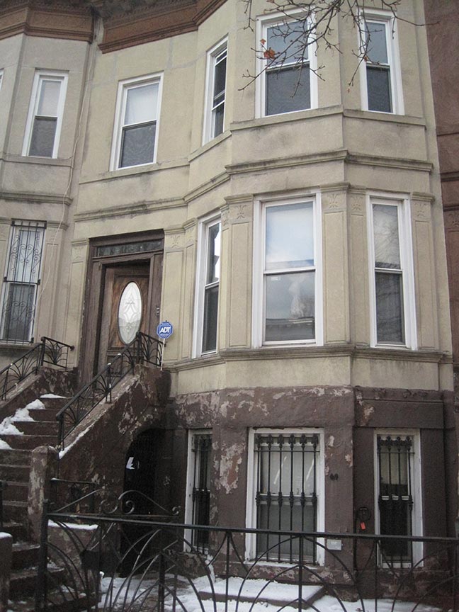
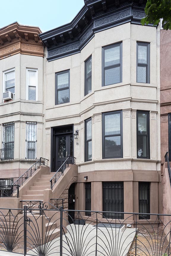
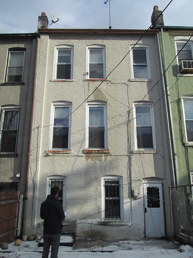
Today’s Throwback is from our Crown Heights Limestone project, which remains a legend in the BHA office as one of the most intense ‘before’ houses we have measured. The photos convey some of the dark, rabbit-warren feel of the neglected rooms, but they do not convey the smell. With Project Manager Ilva Skaraine at the wheel, the floorplan got a meticulous reworking to maximize light and function, but original details and vintage fixtures helped keep the soul of the place intact. Hop into the wayback machine and take a ride.
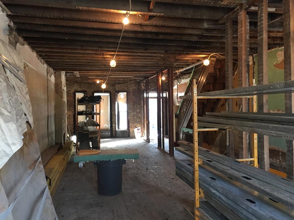
The first floor had the classic brownstone layout (foyer, enclosed stair hall, and a triple-parlor), with unfortunate finishes that had been layered in (and on, and over, and under) and subsequently neglected over the years. There was a lot of damage. The details that could be saved were either restored or salvaged for other projects, but the damage also gave some freedom to reimagine the space completely. With reinforcement from new structural steel, most of the walls could be removed for an open living, dining, and kitchen space. It’s always a bit difficult to show this transformation in photos, because the same angle from a ‘before’ is usually blocked by, well, walls. Standing in the space, however, it is really dramatic.
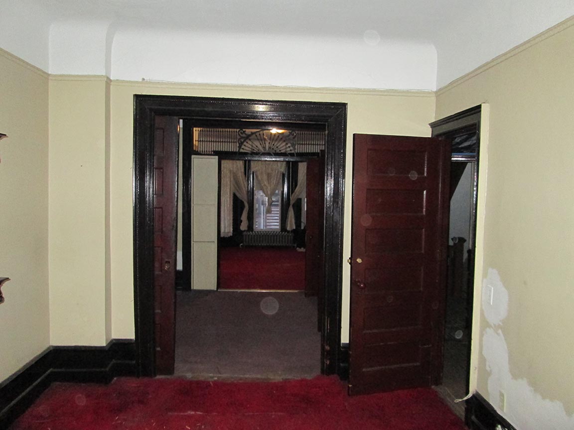
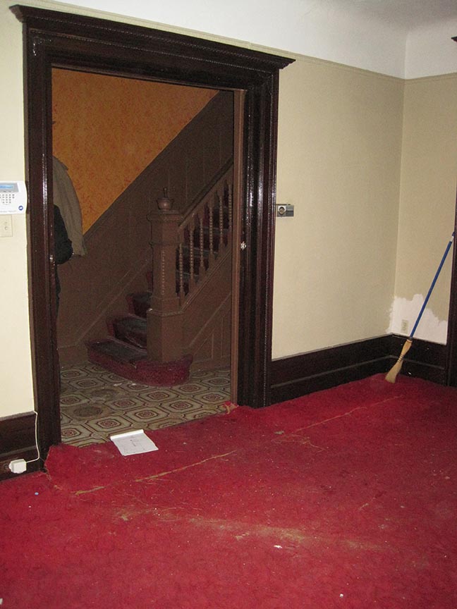
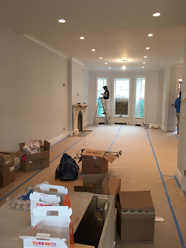
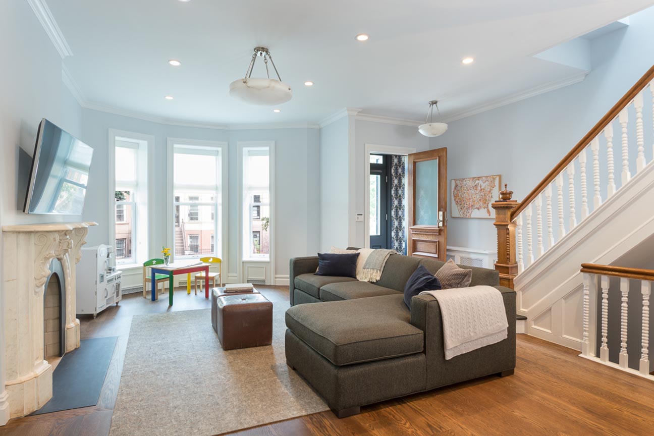
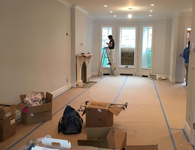
Take this view, for example, and use the front bay windows as your reference point. The first photo here is showing the front parlors, with its Frankenstein-ed partitions of randomly-combined doors and panels (less charming than you’d think) hiding the fireplace on the left. Most of the woodwork had a lot of accumulated damage, but you can see the bay windows up at the front. The second photo is taken from standing in front of those windows, looking back into the hallway. The original newel post was stripped and restored (look for it in next week’s TBT). The third photo is taken near the end of the project, from standing in what is now the kitchen, looking forward through the ghost of the Frankenstein partitions and glorying in all that clean, open space.
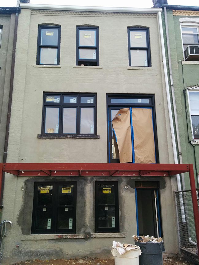
Here’s a great progress photo, after framing went in but before sheetrock.
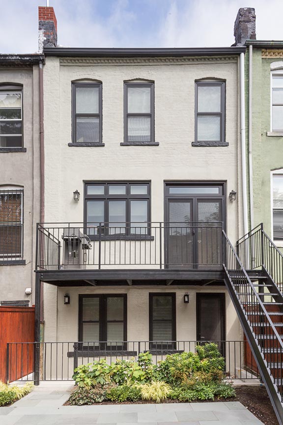
You can see in these photos of the rear how new windows transformed the space, as well; the parlor level had the window sills raised so that kitchen counters could fit beneath, and a large set of double doors now leads to a new deck. The garden-level apartment got an added dose of sunshine with a wider window in the bedroom.
Check in next Thursday for a similar view of the rear of the parlor, and some juicy details.
before&after, brooklyn, brownstone, in-progress, renovation, townhouse